- Made in Canada
- Free Artwork & Mockup
- Fast Turnaround
- No Setup Fees
In order to design customized patches, you need to move your thinking beyond colors and forms and shapes. Good design of patches sends the message about an identity, reflects an organization, builds up a brand or saves a memorable moment in a small yet recognizable piece of artwork. Depending on whether your patch will be used for clothing, uniforms, bags, jackets, caps, or promo products, you should consider both creative and production aspects.
For organizations, clubs, teams, schools, military-themed organizations, motorcycle communities, and personal orders, the choice of custom patches Canada allows creating a unique product which you can wear. Nevertheless, the creation of good patches begins far ahead of embroidery or printing. Concept, design, size, font, color palette, border and fastening are among the factors which affect the end product.
Prior to creating any designs for the patch, it is important to know exactly what the patch is supposed to say. It could display anything from the logo of the company, the name of the team, your personal illustration, the slogan, the mascot, the emblem, or any kind of symbolic graphic design.
Take into account the place where the patch will be placed and what audience it will be viewed by. While a uniform patch will need to have a very professional and easily readable design, a fashion patch could have a little bit more creative art in it. In addition, a commemorative patch will use lots of dates, symbols, and significant graphics.
This way, taking all of these practical aspects into consideration from the start will prevent further re-designs.
It should be noted that any patches’ artworks have to stay clear after scaling down to their actual production size. The artwork which looks really good on the screen may turn out to be hard to reproduce in case it is turned into embroidery.
Always begin with the core element of the patch. It could be any symbol, mascot, lettering, or even a simple illustration, but never a complex composition which involves lots of little details. The artwork with fine lines, tiny text, detailed pattern, and other complicated elements will become unclear in the process of production.
The goal is not to take away the personality of the artwork, but to make sure that the most significant features of the artwork stay clear.
As an example, a patch for the sports team could include a simplified mascot with big lettering instead of trying to reproduce the whole illustration.
However, the shape of the patch should complement the design. It can be round, rectangular, square, shield-shaped, arched, oval, or a special silhouette.
The round form of the patch can be appropriate for badge, club, and organization logos, while the shield will give your design a more traditional or official look. As for irregular shapes, they can be very helpful if the design itself has an unusual silhouette.
Just as important as the shape of the patch is its border since it creates a separation between the patch and the fabric under it. The border contrast can enhance the design.
If you decide to customize your patches, think about how your design, patch shape, and border fit together. These elements should look like they belong together, not like they were put together after the fact.
Color choice affects visibility, personality, and brand recognition. A good patch is one that makes use of a color scheme rather than trying to include all the colors there are.
Color contrast is especially crucial. For instance, using dark letters on a dark background would make it hard for readers to see them despite the colors being appealing by themselves. In addition, colors that have low color contrast tend to blend into each other during production.
If it is a brand patch, it would be better if you used the color scheme of that brand. However, if it is for your own use, then you could use a color palette that suits the mood of that patch. Colorful colors would make the design look lively while dull colors would make it appear traditional.
In addition, you should think about the interaction between the colors and the surface on which the patch will be placed.
Text is among the toughest components in creating patches, as it has to be recognizable even at a small size. An ornamental font can look great on a computer screen but it might turn out to be hard to produce via embroidery.
Typeface selection has to be dictated by legibility. Fonts that are bold, clear, and properly spaced will be easier to read than excessively thin or fancy ones.
The amount of text must also be restricted. A large sentence written on a patch will require either increasing the patch size or using another technique for its production. If it is really important, try to reduce the sentence while keeping the original message.
Space between letters will also influence the final result. Letters that are too close together will merge due to embroidery thread or other production techniques.
The choice of the production technique needs to be taken into consideration during the creation of the artwork as some techniques are more capable of reproducing certain types of images than others.
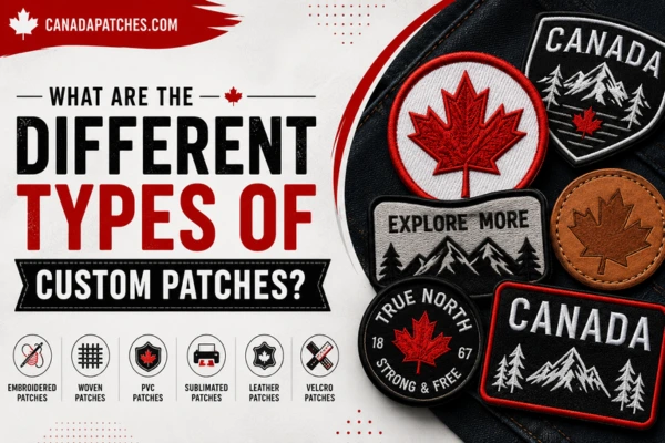
Embroidery patches create an image using threads and work best with bold graphics, letters, logos and textures.
Printed patches, on the other hand, can recreate more complicated artwork, gradients and photographs as well as detailed images as the image is printed directly onto the patch’s surface.
It would be unwise, therefore, to create the artwork without knowing what technique will be used for the production.
It is here that custom iron on patches can be helpful when convenient fastening of patches becomes an issue. The fact that their backing is heat activated allows applying them to appropriate fabric without stitching them in any way.
In addition, deciding on the production technique beforehand allows adapting the artwork to it rather than trying to fit the finished design to the production technique.
The right production method depends on the artwork, intended use, desired appearance, and level of detail.
| Feature | Embroidered Patches | Printed Patches |
| Visual Style | Textured, traditional, and dimensional | Smooth and highly detailed |
| Fine Details | Good for simple designs | Good for complicated artwork |
| Gradients | Difficult to achieve | Can reproduce gradients effectively |
| Text | Good for bold lettering | Good for complicated typography |
| Photographic Artwork | Unsuitable for photographic art | Good for photographs |
| Durability | Excellent for most everyday uses | Depends on the materials and manufacturing process |
| Appearance | Traditional and textured | Modern and highly detailed |
| Best Use | Uniforms, clubs, teams, badges, and traditional artwork | Complicated illustrations, colorful designs, and graphic artwork |
Neither method is universally better. The choice should be based on what the artwork needs to communicate and how the finished patch will be used.
Durability starts from choosing proper materials and construction, but the design itself is important as well. The patch that is intended to be used outdoors often, in workwear or uniforms, and subjected to frequent washing must be designed in such a way that it won’t rely on extremely delicate details.
Proper borders, shapes, lettering, and artwork can help the patch retain its appearance through the usual wear and tear process.
Also, the patch application technique is significant. Sew-on patches are a classic method, whereas heat activated backing makes application easier. In some cases, stitching might still be necessary even if the iron-on backing is provided, especially if there is a lot of friction or washing.
Designing taking into account the conditions of final use is essential.
A good patch design does not simply convey the name of an organization. A good patch design must build on the identity of the name.
For a company, it could be through the use of a certain set of color palettes and perhaps even a logo and/or symbol. In sports organizations, it can be the mascot or colors of the team. Club or community patches can use symbols to denote common interest or membership.
The importance of consistency cannot be overstated in the case of patches as part of an entire brand identity program. All these branding elements should match the same visual identity language used by the patch.
This means the patch will be more than just an accessory. The patch is a physical representation of the identity that people know.
One of the most common mistakes is trying to include too much information in a limited space. Excessive text, numerous colors, complicated illustrations, and tiny decorative elements can make a patch visually confusing.
Another mistake is ignoring the actual size of the finished product. Artwork should always be reviewed at its intended physical dimensions rather than only at a large digital scale.
Poor contrast can also reduce readability, while inconsistent typography can make an otherwise professional design look unfinished.
It is equally important to review the final artwork carefully before production. Check spelling, dates, logos, proportions, colors, and placement. Corrections are significantly easier before manufacturing begins.
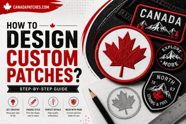
The process of creating a patch becomes much easier when it moves systematically from concept to finished artwork. Begin by defining the purpose and audience, then select the central visual element and establish the shape, border, colors, and typography.
Next, simplify the artwork for the intended production method. Check how the design looks at its actual size and make sure the most important elements remain recognizable. At this stage, consider whether embroidery, printing, or another technique is appropriate.
A final design review should then examine readability, color contrast, proportions, attachment requirements, and the surface where the patch will be applied.
When you design custom patches with both creativity and production requirements in mind, the result is more likely to look professional and remain effective after it becomes a physical product.
The best patch designs are not necessarily the most complicated. They are the ones that communicate their intended message quickly, maintain visual clarity, and feel appropriate for the people or organization they represent.
Learning how to design custom patches involves combining visual creativity with practical design decisions. The strongest results come from understanding the purpose of the patch, simplifying artwork appropriately, selecting readable typography, establishing strong color contrast, and choosing a production method that supports the design.
Whether the finished patch is intended for a uniform, jacket, backpack, sports kit, workwear, or promotional purpose, thoughtful preparation can make a significant difference. A well-designed patch should be recognizable, durable, visually balanced, and meaningful to the person or organization using it.
By treating patch design as both a creative and production-focused process, it becomes possible to transform a simple idea into a distinctive piece of wearable identity that looks purposeful long after it leaves the design screen.
Talk to our patch experts

High quality. Fast turnaround. 100% satisfaction guaranteed.